The Stories Behind Mihailo Andic's Iconic Album Covers for Lil Yachty, Quavo, Summer Walker, and More
Cold pitching his ideas to artists like Lil Yachty helped Mihailo Andic become the sought after art director he is today. Here, he details how some of his best album covers came together.
Staff Writer, Complex Style. @Lei_Takanashi
Four years ago, before Mihailo Andic designed album covers for the likes of Lil Yachty, Lil Baby, and Quavo, he was a 22-year-old college graduate who just landed his first job as a junior art director in an advertising agency in Toronto. However, running social media accounts for beer companies wasn’t really the Oakville, Ontario native’s dream gig. Ever since Andic picked up physical copies of My Beautiful Dark Twisted Fantasy and The Weeknd’s first mixtapes as a teenager, he knew that album art was his true calling. So even with a full time job during the day, Andic was still determined to get his foot in the door. He started making album covers in 2015 for local Toronto artists like Derek Wise, Safe, and The Prime Boys. But Andic was always determined to create album art for bigger acts, even if it meant working around the clock.
“Right after work, every day after 7:00 PM, I'd come home and start working on my own stuff for music. Making logos, cover art, branding, and other random things for artists every day until 3:00 AM,” says Andic, who sent cold email pitches to artists like Lil Yachty filled with PDFs of branding and album art ideas. “To be honest, I was working on my own stuff during my day job, too. I had to find a happy medium because I knew that eventually it would all pay off.”
Since cold pitching Lil Yachty with an idea for the cover of Lil Boat in 2016, Andic has gone on to become the Atlanta rapper’s go-to art director and he’s helped design some of the most iconic hip-hop and R&B records of the past five years. When Andic details the work that went into album covers for projects like Nuthin' 2 Prove or Quavo Huncho, it becomes clear that Andic is a workhorse and a jack of all trades. Whether it’s making an oil-painting of Lil Baby on Photoshop or photographing Lil Yachty around sunset in the waters of Marina del Rey, California, Andic works day and night to make a damn good record cover for his clients. We asked Andic, who is based in Toronto, to break down his design process and the stories behind his best album covers over the years. And be sure to check out our list of the best 30 image makers right now.
'Lil Boat' (2016)
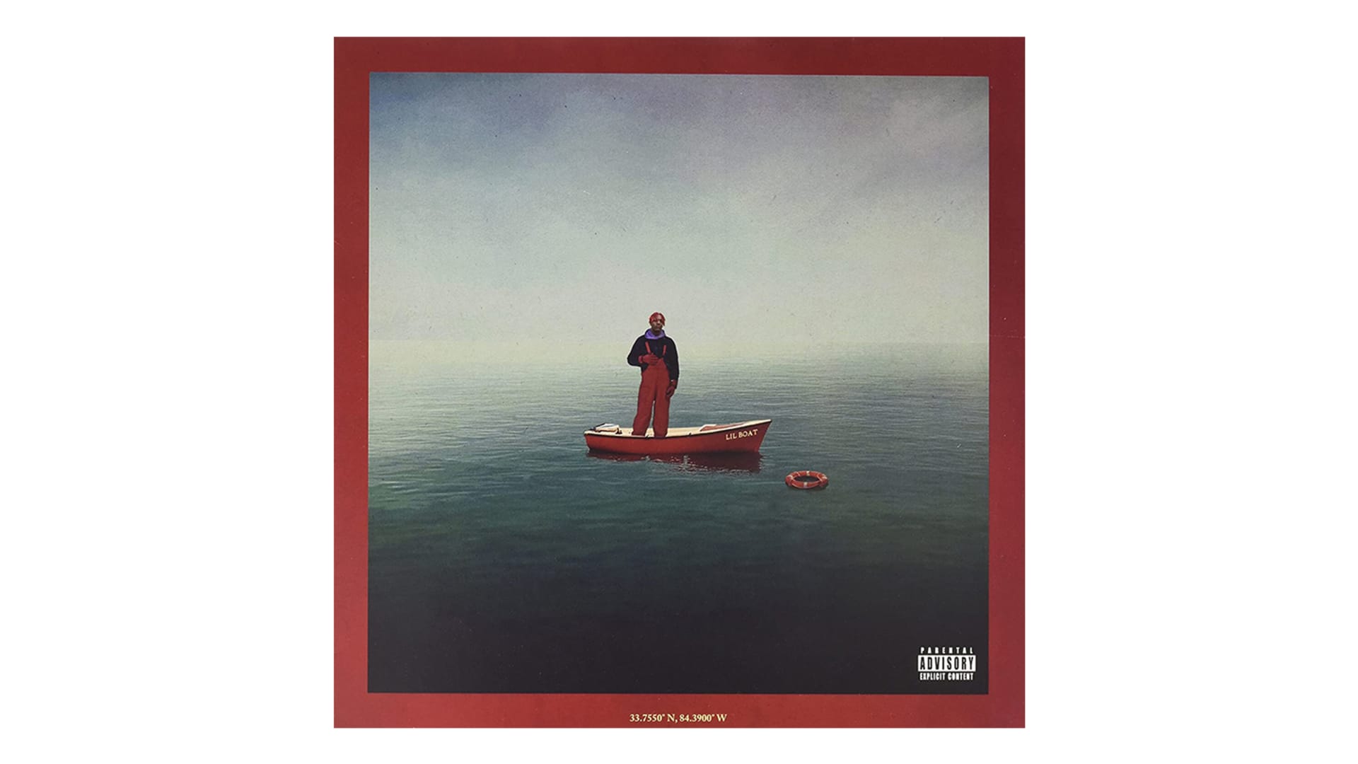
So this was around February of 2016 and I was actually reaching out to a bunch of artists in one night by just sending out cold emails with ideas. One of my brother's friends came over to hang out and he mentioned Lil Yachty. So he sent me his SoundCloud link. And he's like: ‘You should check it out. He has two songs out. I think he's going to blow up.’
So I went on his SoundCloud and I saw his email in the side profile. I was just going through Tumblr and Pinterest and then got this idea. I put together three initial rough concepts with him on the boat. And I just started writing an email. I was like, ‘Hey, I think this could be a cool direction to take Yachty's branding and art direction. Let me know what you think, here are a few concepts.’
I didn't think anything of it when I sent it. Later that night, I was at a party and got an email back. I was kind of surprised because at the time I never got a response from an artist that big so quickly. The next day, I left work early and talked to [Kevin] Coach K [Lee] for an hour on the phone. I said, ‘Listen, we should do this cover, get the proper pictures. And depending on how soon we're going to drop, I can turn it around pretty quickly.’ Yachty's dad helped with the photography and we got that done in the next few weeks. When March 9 came around, we were getting ready to drop that and Coach told me we needed a back cover.
"Although it looks like a real photo, it’s just a bunch of photos molded into one. There's a lot of elements in that cover that are just built off stock images."–Mihailo Andic
I remember frantically like leaving work around 5:30 PM, and I think he said he was dropping it at 7:00 PM. My computer died and I was kind of holding up the release a bit. I said: ‘Coach, let me just get home, charge my computer, I'll get you the back cover and we can drop it.’ And then I think it dropped around 7:30 PM and the rest was history. I was never really tagged in anything on social media so I think everybody kind of found out that I worked on it and it was a huge moment.
Although it looks like a real photo, it’s just a bunch of photos molded into one. There's a lot of elements in that cover that are just built off stock images like the texture of the background. It’s all image manipulation, which is something I’m really good at. I used the Pen Tool on Photoshop to take things out, mold things onto his body, put in the boat, the lifebuoy, the water and the sky. The cover for Summer Songs 2, which was made out of a picture from the “Broccoli” music video, was the same thing. I wasn’t doing photography yet and was just using Adobe Photoshop at the time.
The next day at work, everybody was seeing what was happening and my name was everywhere. Yachty's name was everywhere, everybody was like ‘What's going on? What's this thing that you posted? How's it blowing up on all these platforms like The Fader, Complex, Pigeons & Planes, and all that?’ I was getting all this press and everybody at work was just stunned. I was just sitting there and taking it all in.
'Free 6LACK' (2016)
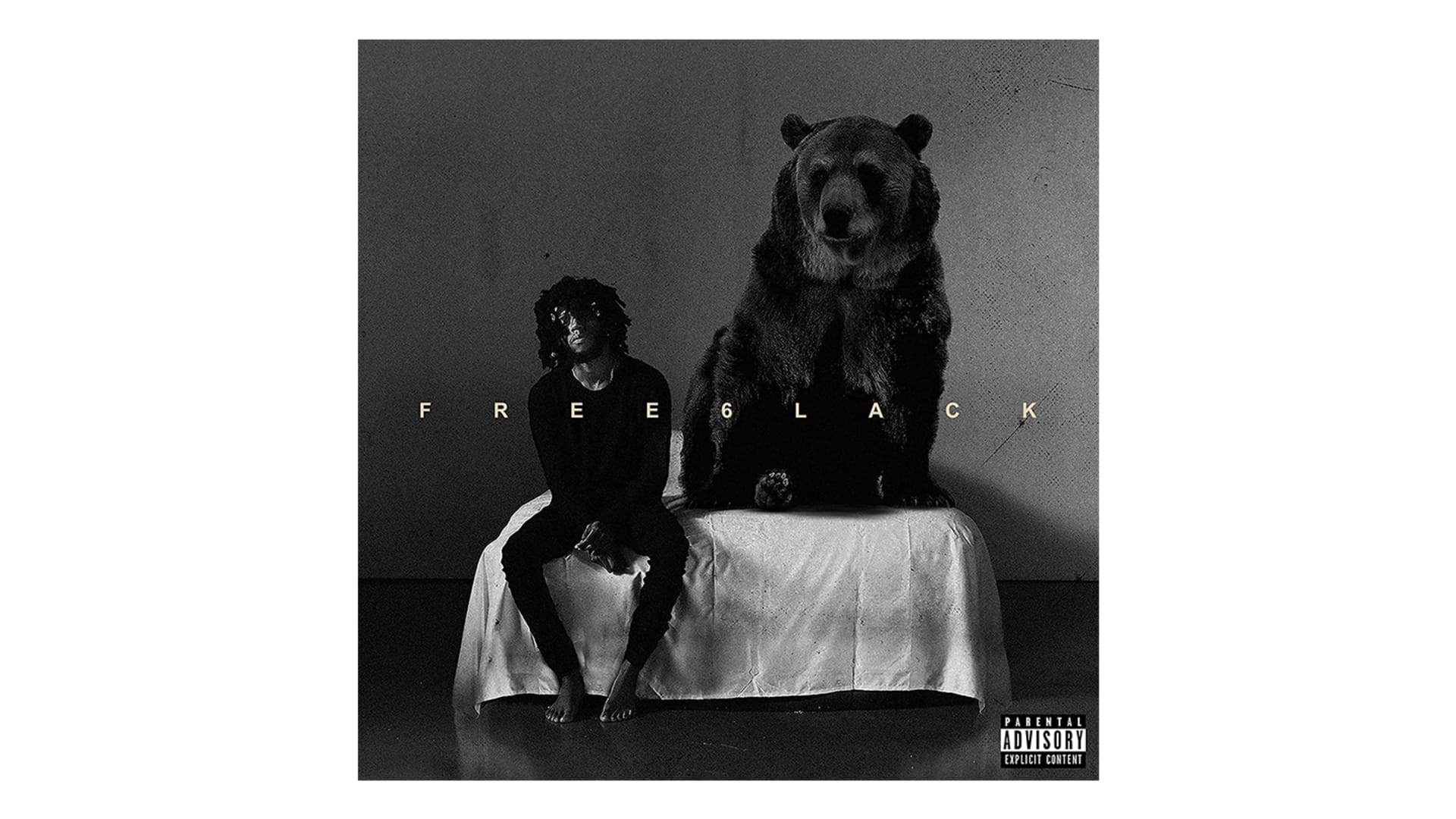
Free 6LACK came a few months after Lil Boat and that came to life after cold emailing and reaching out to LVRN. This was way before 6LACK ever dropped anything under that label. I initially reached out to help Raury when he was signed to LVRN. I was talking to Sean Famoso McNichol and Carlon Ramong at the time and they asked if I was interested in working with 6LACK since he was ready to drop his album. That cover came together in about two to three months. I knew they were shooting the music video for “Prblms,” and after a discussion we all knew that 6LACK wanted to do something with the bear on set. So Anthony Cabaero took pictures of that bear. When I got those assets, I put together a few ideas, but it was pretty close knit when we were coming up with what the album branding and what the cover was going to be. Free 6LACK ended up being the other album cover that blew up that year.
In 2016 I was sending out these emails and no exaggeration, I was sending out hundreds of emails every week. Any artist that you listened to, I was trying to reach out to them. I was sending them PDFs of ideas. And these were like five to 10 pages of just quick concepts. I don't think there's one artist that I didn't reach out to in the last few years. But in 2016 I just took my chances. I didn't shy away from reaching out and extending my helping hand. East Atlanta Love Letter Two was kind of the same deal. Natalie O’Moore took that photo of him in the kitchen recording while he was holding his newborn baby. It perfectly captured that stage of life he was in.
'Teenage Emotions' (2017)
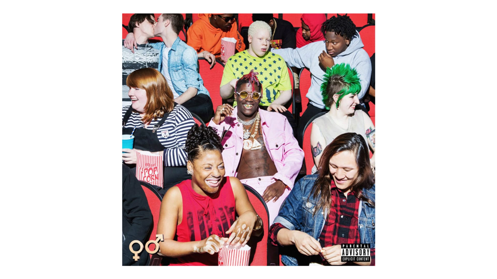
That started on the Toronto stop of Yachty's first tour. We all met up in person and Coach was like, ‘Man, Yachty has this album. It's going to be called Teenage Emotions.' Once I heard that name, I thought it was really captivating. It's cool and it makes sense for him. This was in the summer of 2016 and that was a whole year before the album came out. In the second month of 2017, I was in Los Angeles working on another album cover and Yachty ended up being in LA with Coach at the same time. I visited them at Capitol Building, and that was also the first time I met everybody at Capitol and Motown. Coach was like: ‘You should come to the studio tonight Yachty's just going to go record. And we'll talk about this album cover.’
I was kind of stressed out because I still didn't know what this cover was going to be. I don't think Yachty knew at the time either. He had a few ideas, but we didn't really land on a concrete concept. So I went to the studio that night at around 3:00 AM. Yachty and I just kind of started going through ideas I put together in a PDF. He said ‘I don't know if I want to do anything, like nautical based for this one, I kind of want to do something with myself or a bunch of kids from high school.’
"You obviously had this positive reaction. But there were people thinking that this was something the label did or they were egging Yachty to do this. It was all him."–Mihailo Andic
I had this reference photo of a lady sitting in the middle of a theater and I said: ‘How about we put them all in a theater because that's a big thing that teenagers do, they go to the movies. So what if we combine these two ideas, and we made a cover like that?’ So we started listing out all those different kids that ended up being on the cover. He started naming them, and I started throwing out ideas too, I showed him the reference and he's like, ‘That's it, that's the cover.’
He was working closely with Kenneth Cappello at the time and I love his work, too. So that was an easy decision. Kenneth shot the cover and it all came together pretty quickly. We shot it within the next month. After that, it took a few weeks to kind of get the photo and the edits perfectly. When it came out it was a huge moment again.
It was interesting to see that come together and how the world reacted to it. You obviously had this positive reaction. But there were people thinking that this was something the label did or they were egging Yachty to do this. It was all him. It was all of us putting that together and thinking of those ideas from scratch.
'Quality Control: Control The Streets, Volume 1 & 2' (2017 & 2019)
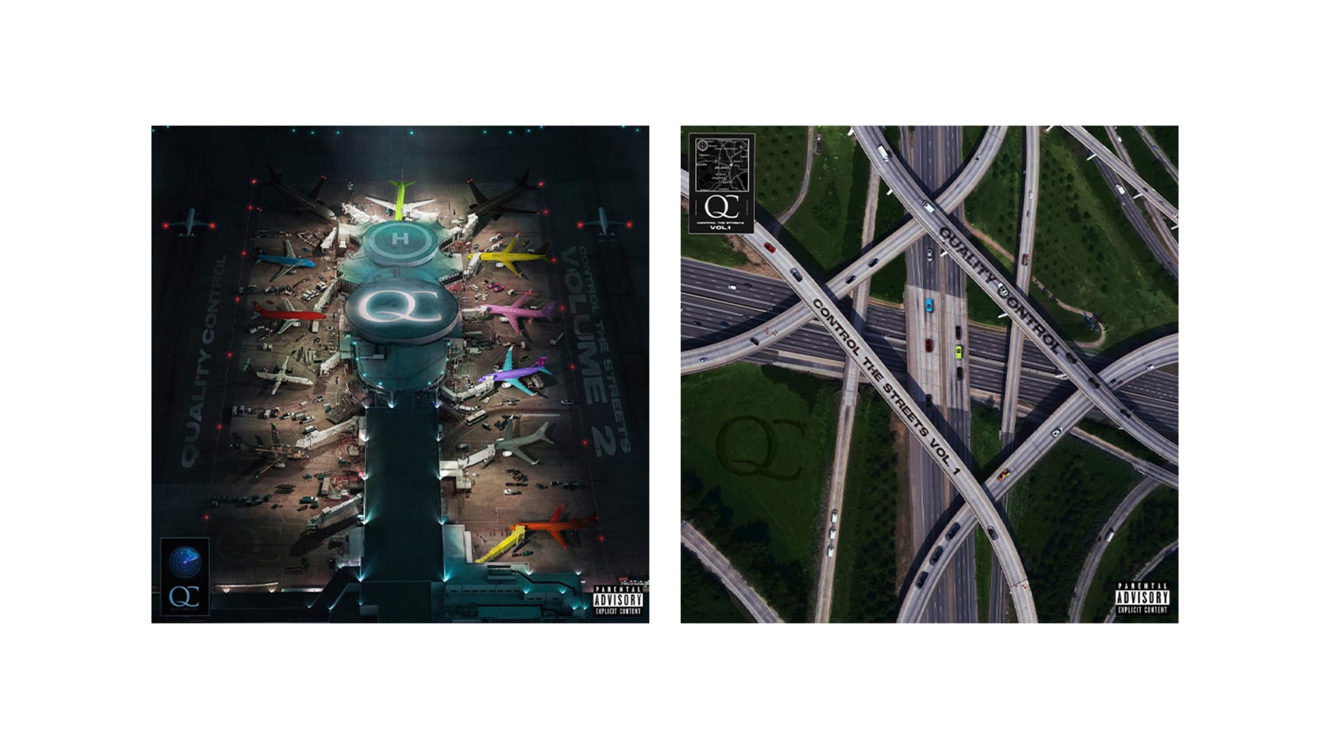
The first Control The Streets tape came out a few months after Teenage Emotions. At that point, I became really close with Coach K and [Pierre] Pee [Thomas]. Quality Control is like family to me and they've been a huge part of my career. They really introduced me to all of this and I am really grateful they brought me all this work. At the time, they mentioned they were releasing a compilation tape with all their artists on it. However, they didn't want photos of everybody on the cover. So we had to figure out a creative way to put everybody together into one visual.
They gave me like a week to think of ideas. I had about 10 ideas inside this PDF and one of them was to have everybody's cars on a highway or a road. It could fit everybody into one cover and you wouldn't have to take pictures of them or have their faces in it. Pee loved it.
Spaghetti Junction is this huge highway intersection in Atlanta and it became the main thing we incorporated into the cover. So I had to find a stock image of Spaghetti Junction, find a bunch of car assets that I had to manipulate to make it resemble Yachty's car, Migos' car, and the cars of other artists who were on the label at the time. That took three to five days to put together and it came out a few weeks later. That was also a pretty big moment because everybody was really interested in that concept of an album cover coming from a bird's eye view. For the second one, I kind of had that idea a bit before and I did the same thing. They let me do my thing, they loved it, and thought it was a perfect continuation from the last cover. It makes sense to just put all those jets together at the QC terminal.
'Lil Boat 2' (2018)
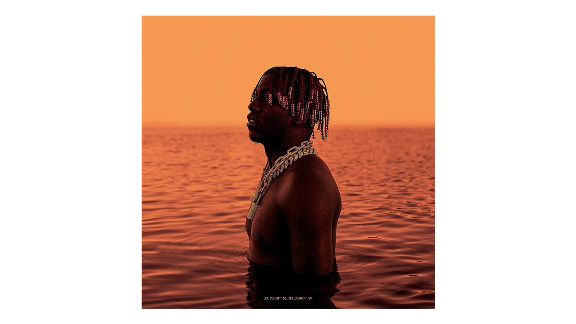
Lil Boat 2 is definitely one of my favorites because I explored photography for the first time and this was the first thing I ever shot. I was in Atlanta at Yachty's place and we were discussing this cover a few months before we shot it. I had this photo reference of a kid just in the water. It's one of me and Yachty’s favorite photos to this day. I thought why don't we just recreate this and keep it simple? We were going through a lot of cool, but complex, ideas for the Lil Boat 2 cover. We were trying to think of something that was creative and would get people talking. I'm really happy that we ended up keeping it simple and just not stressing about doing something that's over complicated or a bit off brand.
So a few months after, we were initially planning to shoot it at a lake in Atlanta. I told Lil Yachty, ‘Man, why don't I shoot it, I think I can pull it off.’ Without hesitation, he said ‘Let's do it for sure. You can do it.’ He didn't think anything of it. I just wanted to try something new and wanted to see how far I could step out of my comfort zone. I did my research on cameras and lenses. My younger brother, Dragan Andic or @the.97, is really talented at photography and made some recommendations. We didn't end up shooting in Atlanta because Yachty had to fly out to LA. Funny enough, we were in the QC studio and Yachty said that I should go to LA a day before to scout out a location for the shoot.
Those next 72 hours were pretty stressful because I had no idea where we were going to shoot. I was looking up all these beaches and small lakes in different locations before I even landed. I arrived in LA around noon and took an Uber from the airport straight to the beach. The final location on my list was in Marina Del Rey and the sun was setting. I was worried that I wasn't going to have enough time to properly scout the location but went anyway. It was perfect. It had a pier, a bunch of boats and this shallow water. I sent a picture to Yachty and he said it was perfect.
"I don't think I've had a better time putting together and coming up with a concept than 'Lil Boat 2' because everything felt so natural."–Mihailo Andic
Yachty flew in the next day and we were all just having a good time in the water. All of us were just laughing because Yachty was standing in this water that was freezing cold. But we didn't have a lot of time to shoot because it was close to sunset. The first few shots I took didn't turn out great because I had no idea what I was doing. I was still trying to figure out the aperture and all that. After 20 minutes of shooting I looked at the photos and it felt like I had the one. Yachty had a party to go to that night and I was invited, but I decided to stay at the hotel to perfect this cover and get it done while I was in LA with him. That night, I put together like 25 to 30 cover options, with and without text. The cover’s orange hue came from one of the shots taken close to sunset.
The next morning, we went to one of his favorite diner spots to get breakfast, I brought my computer, showed him that cover, and the rest was history. He loved it and we got it approved by Coach 20 minutes later. I don't think I've had a better time putting together and coming up with a concept than Lil Boat 2 because everything felt so natural. It happened within such a short amount of time. I really didn't have time to think about it. When I look back on it, I definitely should have enjoyed it a lot more than I did. I was so worried about getting everything right. That experience taught me to just live in the moment. Enjoy those times where you're putting something together and bringing it to life.
'Quavo Huncho' (2018)
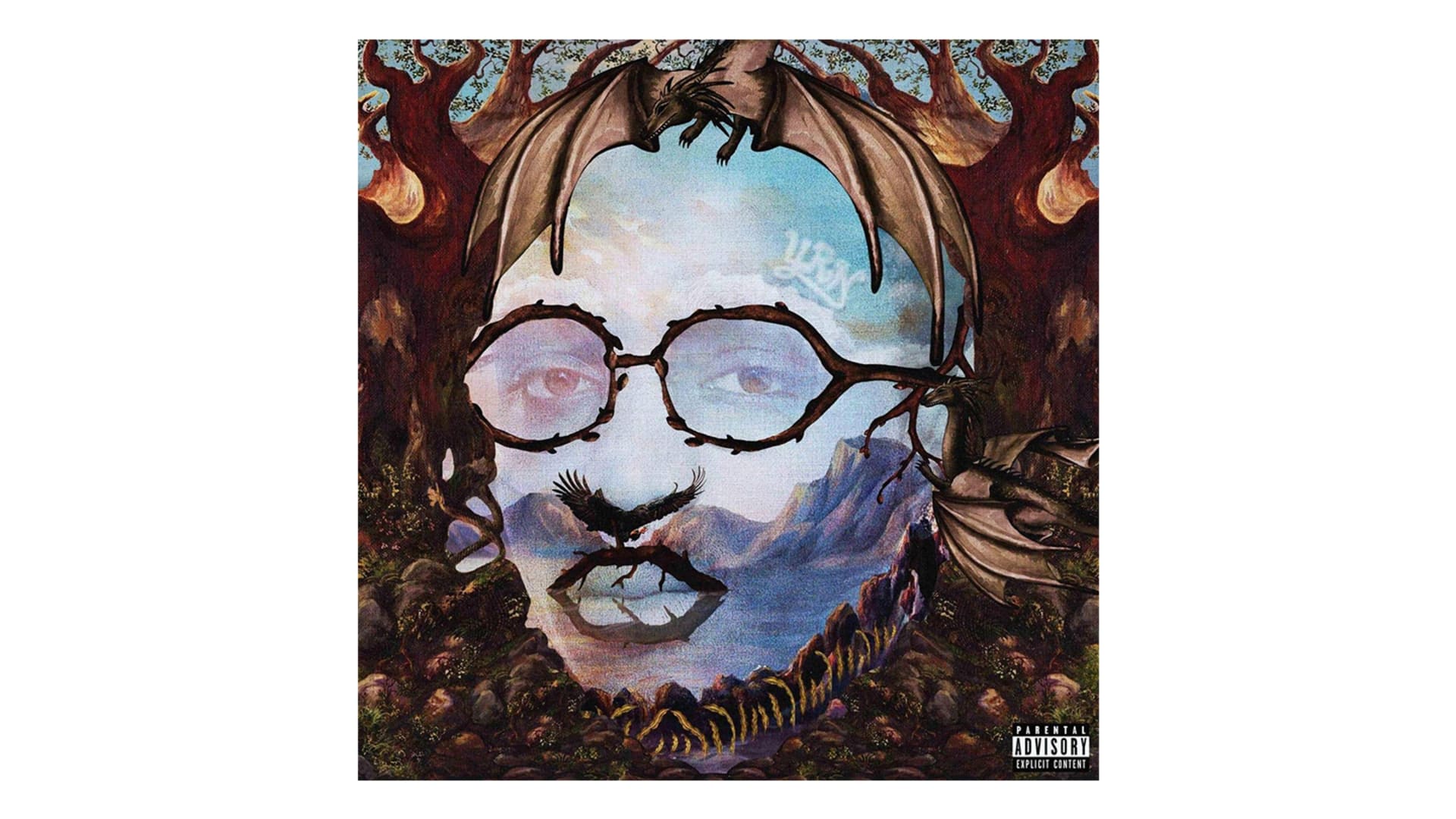
Some projects you only have 48 to 72 hours to complete, that was the case with Quavo Huncho. Obviously, you can't paint a picture within that time frame, so I had to think on my feet and figure that one out pretty quickly. Pee introduced me to Quavo and this was the first time that I ever talked to him. He sent me this board of references and said he wanted it to look like these surreal, optical illusion paintings. Where faces are formed out of nature, trees, forests, lakes, and all that. I thought it was really interesting and I didn't expect them to go in that direction with the solo project. I was actually pretty happy that it was something different. Right after I got references, they gave me a timeline of three days.
The first night I was sending out ideas that didn't look anything like the references, I kind of tried to step out of the box and do a bunch of different ideas. Quavo was like: ‘These are cool, but I don't really think it'll stick like the reference, can you do something similar to this photo, like this exact painting.’ I dialed down on the options and focused on one image. I still had to figure out how I was going to make this look like a painting and bring it to life within this time frame.
I started looking up stock images and vector illustrations. Elements like trees, animals, and water. I started combining real photos with vectors, illustrations, and painted elements. I got a photo of Quavo's face from the label, and used that as the foundation to start forming his face. I collaged stuff together piece by piece to form his face.
I didn't get any sleep, but after two days, I came out with the image that ended up being the cover. Quavo and Pee called me and were really excited about it. A week later, the cover dropped and nobody expected him to do something so creative and artistic. And I was actually really happy with the result of that. It's a lot of stress, but I do work really well under those short time frames. You just jump into motion and can't really think about it. I think that's when some of the best work comes out for me personally. I would prefer to have a lot of time to plan out a shoot or concept. But when those kinds of ideas roll around, it's great to work on those as well. The album art for Lil Baby’s My Turn kind of followed the same idea and I didn't have a lot of time to think of that either. I'm just really good with textures and making things look like paintings or illustrations.
'Nuthin' 2 Prove' (2018)
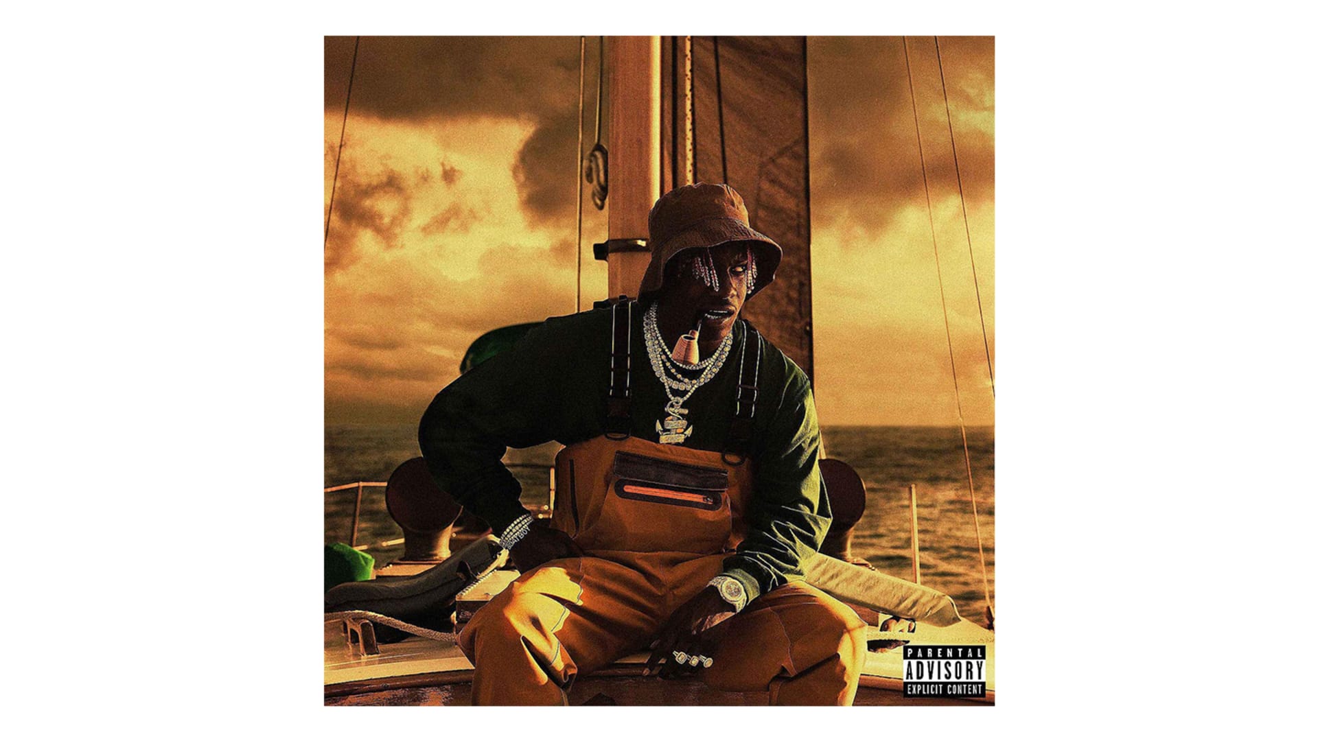
I made the covers for Quavo Huncho and Nuthin' 2 Prove, within the same week. We kind of did the same thing that we did with Lil Boat 2. I came up with a bunch of concepts and he loved the idea of doing something that resembled a classic sailor photo. That cover came about within 24 hours. Me and Coach rented out the same equipment we used for Lil Boat 2 and it wasn’t an extravagant shoot. It's just me, Yachty, and Coach putting this together from scratch and doing it on the fly. We rented a sailing boat for the day and went to Lake Lanier right outside of Atlanta. Yacthy's stylist put together this great selection of outfits and we ended up going with that one. We went on the boat, I took photos for 45 minutes, got the shot, and then stayed up all night to put together 25 options for Yachty. The next morning, we were stuck between two options. We had another shot where Yachty was standing up. But when Yachty saw the cover with a yellow hue, he approved it on the spot.
This was all done within 24 hours and I remember going home exhausted. I couldn't even keep my eyes open at the airport, but it was all worth it. That month was exhausting and stressful because when you're given two projects of that magnitude, you have to figure it out. It taught me a lot and it pushed me to my limits. But it also made me a lot better at my craft. That goes back to trying out new things and stepping out of your comfort zone. I was really comfortable with photography after shooting Lil Boat 2 and a bunch of other things throughout the year. I was prepared to take on multiple projects at once and became really good with time management. Those were my final two projects for 2018 and that was a great year for myself and the work that I was doing.
'Over It' (2019)
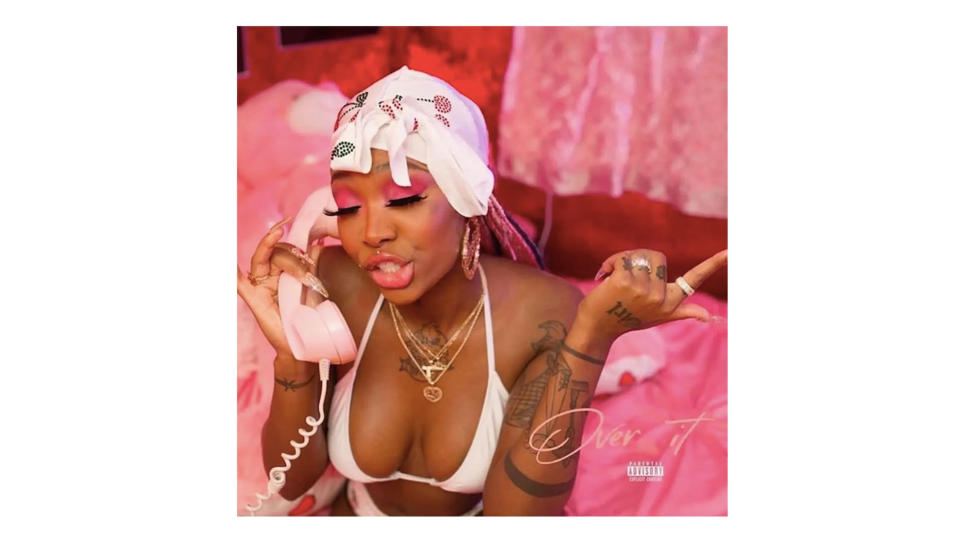
These rollouts always start with Carlon at LVRN coming to us with a game plan. He kind of facilitates who's going to be creative directing it and who's going to be the photographer. Him and Ro.Lexx were the creative leads behind the whole Summer Walker rollout. The look and just building that whole world from the start. Kind of like 6LACK, they were there from the beginning. From the very start of her releasing music through LVRN, planning out her EP, and then her debut album. The first few things that we were doing for Summer Walker were little things like single covers and some typography work.
A few months before it dropped in October, we started that conversation about Over It. They had a pretty clear idea on how they were going to build out that look and stirred up some ideas for a photo shoot. It's really cool how she built that world and obviously it’s in the cover. It looks like she's arguing with someone on the phone. Ro.Lexx took the photo and she’s personally one of my favorite photographers, too.
Nico and I worked on the art direction. We were given the unedited photos and some direction on what Summer wanted. We addressed some of her input and came up with typography, titles, and logos. We started off with just different layouts and different textures, editing the photos, and coming up with typography. I like to do typography that's kind of font based but I also love to make handwritten stuff, which started with Quavo Huncho. The covers we came back with had this really cool vintage or retro feel because that’s what the photos looked like.
Me and Nico went crazy. We sent out a bunch of options to Summer, Ro.Lexx, and Carlon. I remember making some covers with vintage backgrounds and doing some stuff I've never done for anybody else. A lot of options were more complex than what the cover is today. But after two or three rounds, we were just going through some of the more simple stuff that we did. Ultimately, she loved that cover with the title and the small parental advisory sticker in the corner. The process is always fun because you get to see what works and what doesn't. What an artist likes and what they don't like. That's always fun even if the most complex or design-heavy idea doesn't get picked, it's always cool to see what you come up with.


No comments:
Post a Comment